More windows approach for Vision Pro
How many windows is too many?
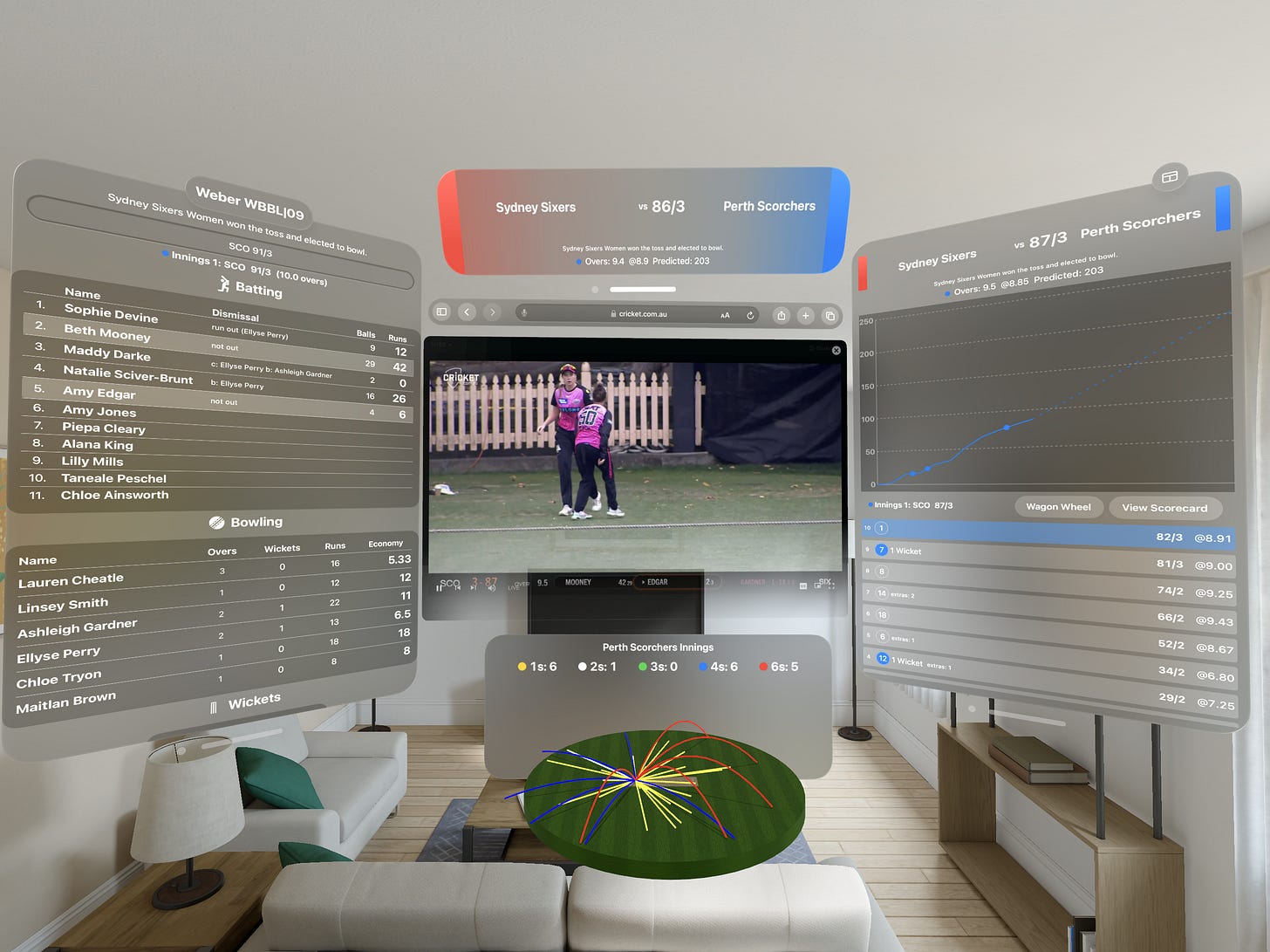
Recently I have been trying to improve the flexibility of my Cricket Scores App to show more even more information about a game at once. Coming from iOS, the initial idea was to have just have one big window that shows everything, but from experience using a Vision Pro, that just feels limiting on device. In Apple’s own words, Vision Pro is an “infinite canvas” so why not make use of that space better.
One of the things that I was really impressed with during the hands on was the ability to resize and position windows in a very natural and intuitive way. This is in contrast to how it works in the simulator which is a very clunky and frustrating experience trying to position things, particularly at specific depths or orientations. This is one area that the simulator fails to simulate the on-device experience.
I have been exploring having different independent windows showing information, as well as content better adapting to the resizing of windows. For example, if a user wants to resize the main game window, which usually shows the run worm and ball-by-ball information, it adapts to being short and wide by showing a simple game banner.
I’m also experimenting with having the ability to pop-out this content to have both views visible at once. Whether this will be a useful approach or too confusing in practice remains to be seen. This approach takes more work, but is a better experience than either artificially restricting the size of the window, or trying to compress a lot of information into a small space.
Practically the way this is achieved is liberal use of ViewThatFits, to provide alternative views for different sized windows. When using the pop-out window button, I set a initial display size that’s appropriate for the header view, which currently is actually the exact same view as the game window, so it’s possible for the user to make this bigger, and it will revert to the full game detail as appropriate.
An extension of this approach is what happens if the window gets really large, should it add even more information, that’s something else I want to play around with going forwards. Perhaps a single window with everything self contained will actually work better in practice, but my feeling in that case is that users will want the ability to customise the layout, perhaps hide and resize views within a window, which seems like a lot of overhead to manage. It would effectively be a window manager within the App itself.
In addition to content adapting to the window size, there are two other screens of information which can all be open simultaneously for a game. This way users can open the information they are interested in, as well as position and resize it as they wish. This is in contrast to iOS where views navigate in and out full screen, meaning there can be some jumping around to get to different information. My feeling is the extra real estate that the Vision Pro affords lends itself to this approach, rather than being limited to a single window. It also means I can rely on the in-built window management.
Now I’m not expecting everyone, or even most people will want this kind of detail, but I’m hoping those that do appreciate the flexibility the app affords.
Apple’s Human Interface Guidelines actually warn against this kind of behaviour stating:
“Too many windows can obscure people’s surroundings, making them feel overwhelmed, constricted, and even uncomfortable” - Apple HIG
I’m hoping with the specific use case of this app, that best practice can be stretched somewhat. It’s still possible to get the full experience of the app with only one open window, but for “power users” it’s possible to get more from the app. I’ll be interesting to see how my approach works in practice as I feel these windows aren’t intrusive and all provide value.
Hopefully this aspect of the User Experience is something that will standardise over time, once developers show their approaches and the platform matures beyond the initial release.


