Adapting an App to visionOS
Documenting the initial experience
I’ve been continuing to explore Vision Pro, this time with the intention of bringing my Cricket App to the device. The App is built in SwiftUI and uses almost exclusively built in components. It also relies heavily on Apple’s design principles, with support for light and dark modes, so in theory and in practice it was easy to get running on the Vision Pro Simulator with little requiring changes. It would have been even easier, but the iOS version was written exclusively on the iPad using Swift Playgrounds, which understandably has no support for visionOS. My solution was to create a brand new visionOS project in Xcode and copy the files across from the Playground package. Not a seamless experience, and they may be a better way, but it gave me a clean start.

Getting it running was one thing, but being a good platform citizen and fitting in seamlessly is another.
The first thing to tackle was the app had no windowing support, so creating an WindowGroup and allowing an individual game’s content to be opened separately was the first step. Getting this working was straightforward, but extracting out some assumptions of the data model to accomodate this new concept took a little more time.
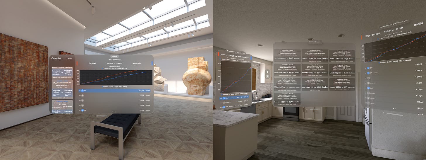
Once the practical steps were out the way, I could turn my attention to making it a bit more compelling of an experience. Adopting ornaments was the first step, adding in a Tab Bar in order to benefit from the rather handy navigation it enables was a natural addition. Whilst playing with ornaments I also tried adding the window title as a top ornament, which I liked the look of more than what I’ve seen as standard, which is a large title in the top left of a window. I’m not completely sold and could drop the idea, but I feel it frees up the content and is more obvious than the subtle tab bar icons to differentiate the current selection. This change also forced me to adopt a grid view rather than a list view for the upcoming games. On visionOS the windows are a default size, so long lists don’t work as well as a grid of content.
I did fall foul of not providing the ornament to the correct view. It only worked when the ornament was added to the main Tab Bar View, not each individual Tab’s View. I was caught here as if added to the Tab’s View it does show, but not if you change tabs and not always. I’m unsure if this is a bug, or user error, but either way it’s something to look out for.
Next was to clean up some of the backgrounds and colours used. One of the first things I noticed was that coloured text just doesn’t work on visionOS. The glass background makes the addition of coloured text very hard to read. There might be exceptions, I would assume this is something that all apps will need to look out for. It is something called out in an Apple Design Video, with their suggesting to add solid colours as a background, but in my situation where the content isn’t a button, this wasn’t an option.
There were also a few places, where I’d used fixed colours, such as the chart background as well as .secondary and .tertiary as background fills as well as layered different blur effects in places. These didn’t work on the Vision Pro, where care needs to be taken to alternate light and dark background views, or at minimum not have lighter on light views. I’m still not happy with where this ended up, but it was already a vast improvement over the initial version.

One area I’ve found hard to understand is sizing and spacing of content. Everything just looks so small and compact on the simulator. I’m aware that windows viewed on device, will be larger and clearer than trying to view on a window on my Mac, but it’s hard to fight the temptation just to double the size of everything to accommodate. Which reminds me, I haven’t yet optimised the layout for accessibility settings, which there are more of than ever on visionOS. I’m confident that adopting the layout to a variety of options such as dynamic type and reduced transparency will help refine the usability across the board.
This is how I anticipate the app being used, in conjunction with live content, giving the viewer additional context about the ongoing game.
All in all, for only a few hours work, I’m really happy with how much progress I was able to make. There’s lots still to improve and iterate on, but considering this is a whole new platform, the transition isn’t as dramatic as it could have been. If you have any suggestions how I might further improve things please let me know.


